
Cosmetics · Beauty
Dêagadê Cosméticos
A brand built to be used end to end.
Dêagadê Cosméticos has no plans to expand internationally in the medium to long term. The brand was designed exclusively for the Brazilian market, so its brand guidelines were produced only in Portuguese, and the pages shown in this case appear in their original language.
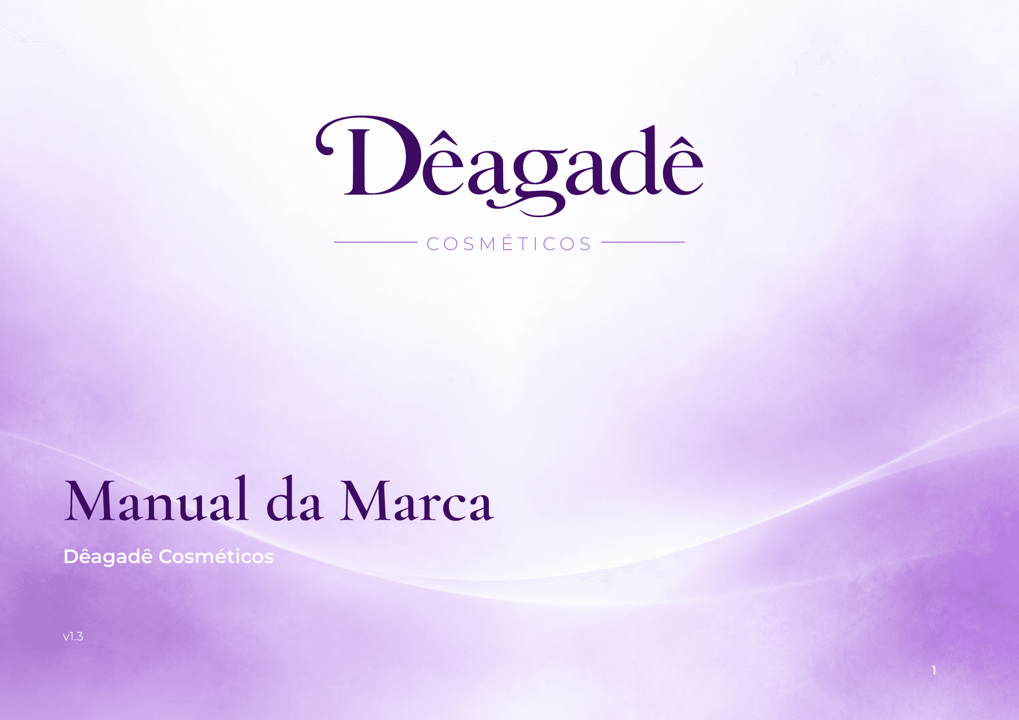
The challenge
Dêagadê Cosméticos started out in curly and coily hair care, with plans to grow into body, skin, fragrance, kids and men's lines. Its previous identity was illustrative and tied the brand to its first product, and nothing guided the people creating for it: every campaign, package and screen started from scratch.
The job was to build a brand that feels affordable without looking cheap, ready to expand, and documented so marketing, design and tech could actually use it day to day.
The process
1. Strategy before design
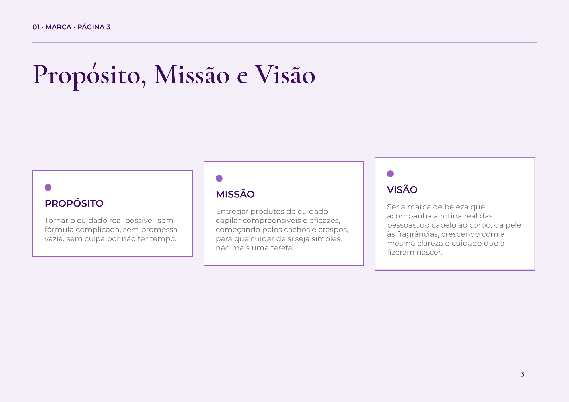
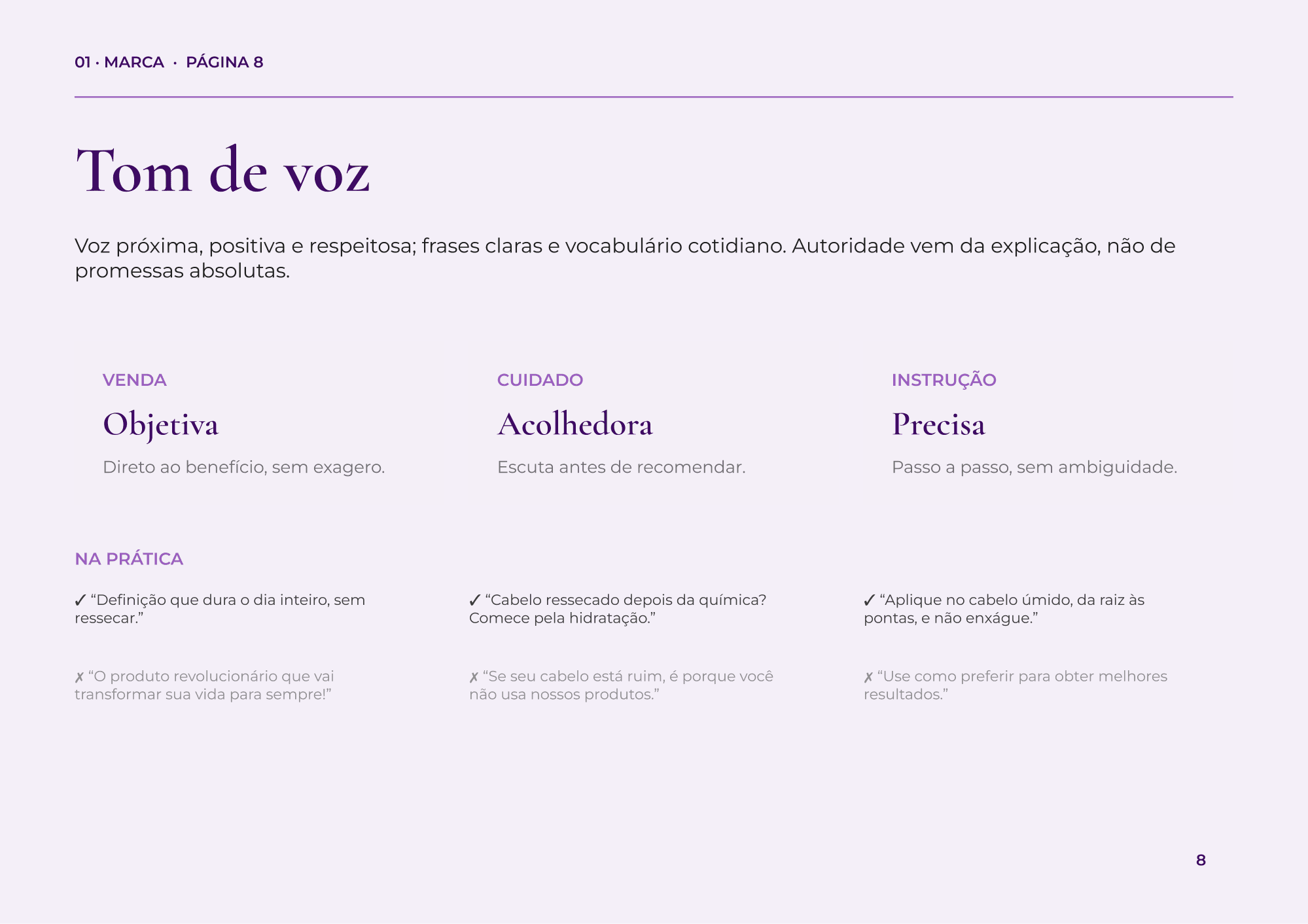
I started with the foundation: purpose, mission, vision, positioning, audiences, values, personality and tone of voice. That layer defines what the brand does and how it speaks before any visual decision. Tone of voice, for example, became practical do and don't examples for selling, caring and instructing.
2. Visual identity
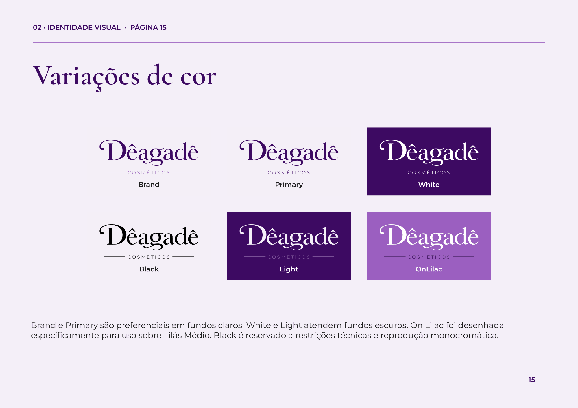
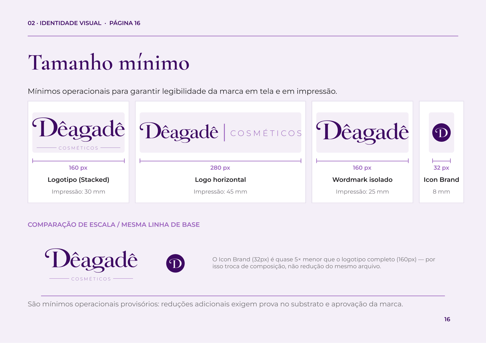
A typographic logo with the "Cosméticos" line as part of the lockup, and a "D" monogram drawn from the wordmark itself, no invented symbol. I documented construction, clear space, six color versions for light, dark and lilac backgrounds, and minimum sizes for screen and print, with the icon at 32px.
3. Color and typography
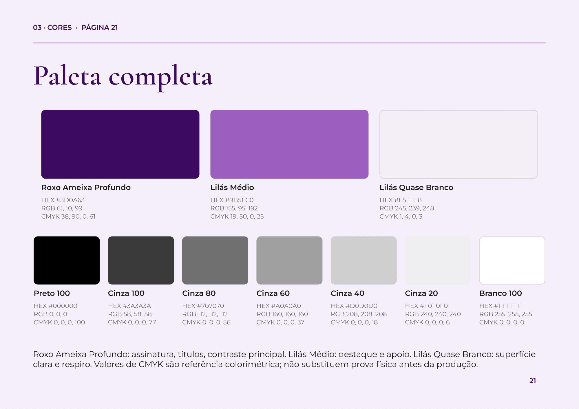
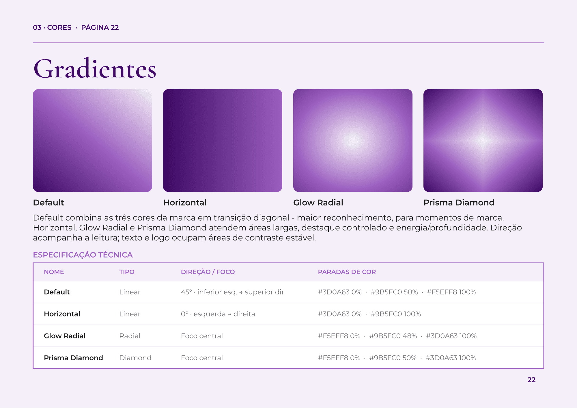
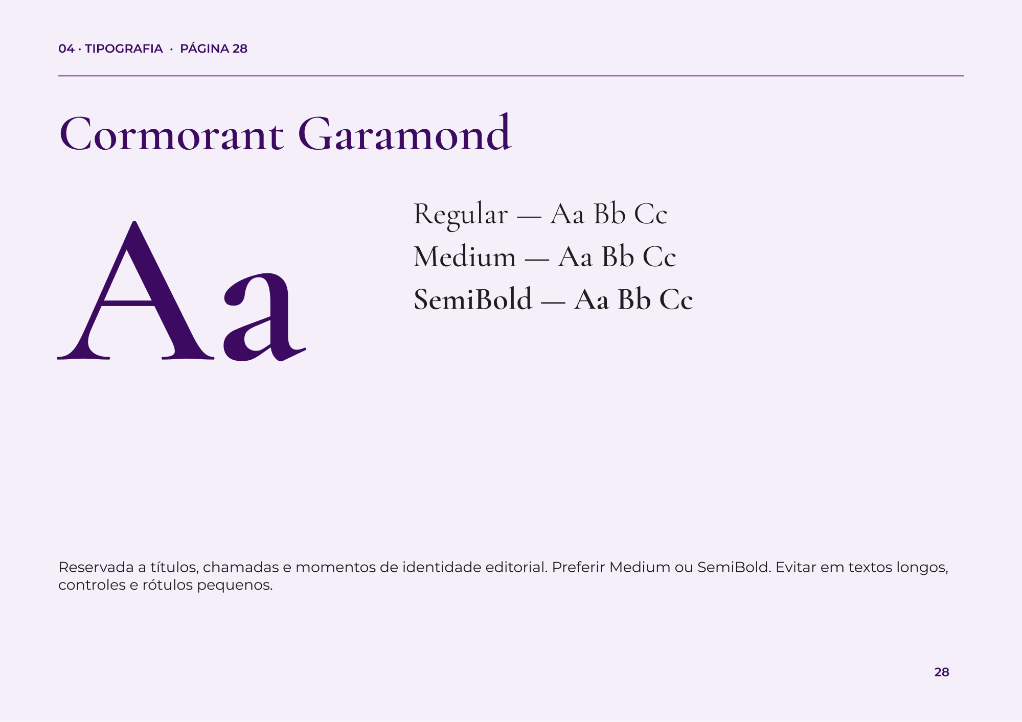
A plum and lilac palette with a neutral scale, specified in HEX, RGB and CMYK, plus four official gradients with technical specs. Every color pairing has its contrast checked against accessibility guidelines (WCAG). For type, Cormorant Garamond carries the brand's editorial voice and Montserrat handles reading, interfaces and technical information.
4. Graphic system
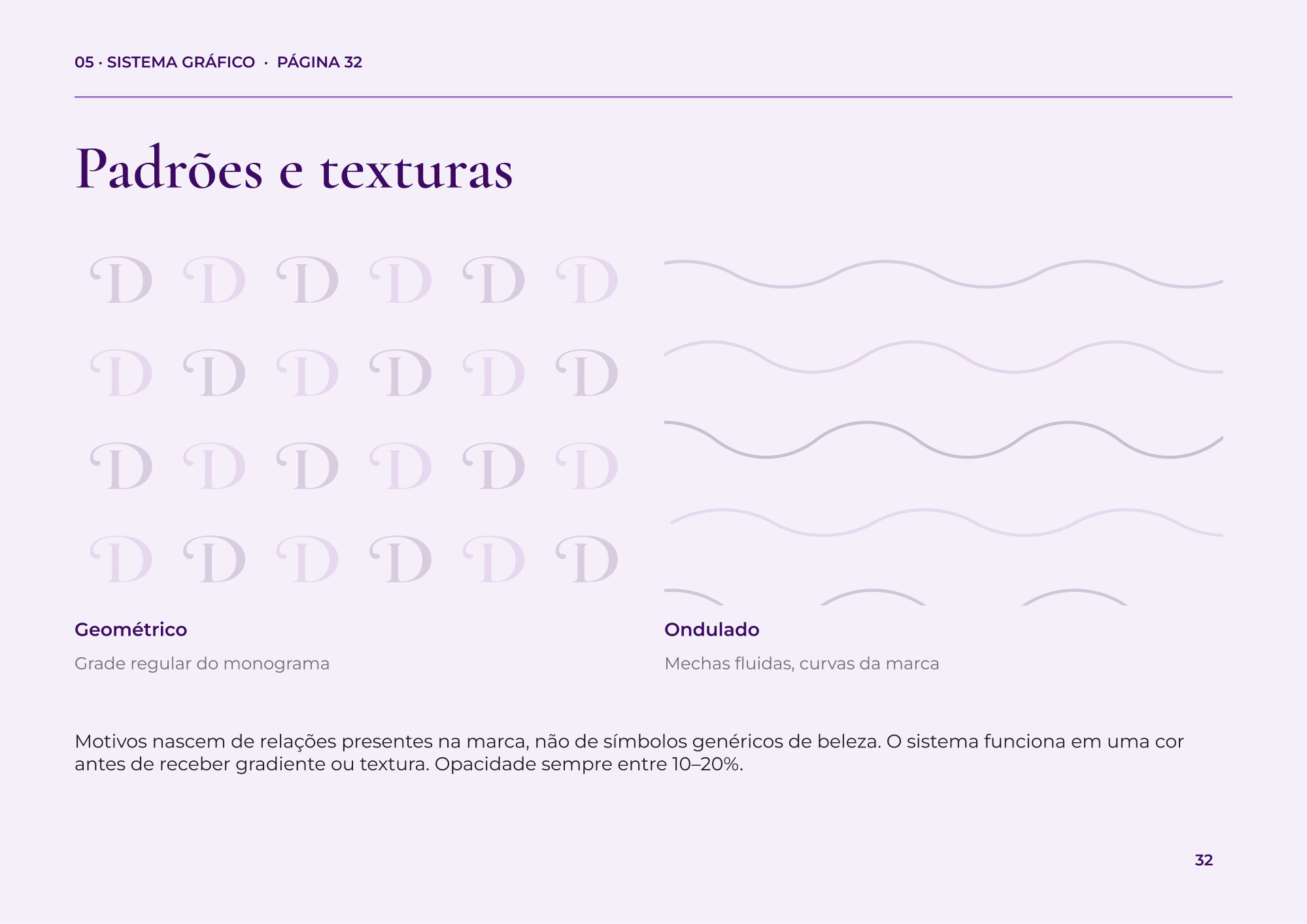
Patterns that come from the brand itself: a grid built from the monogram and waves that echo curls. Photography direction and iconography rules round out the system.
5. Applications, end to end
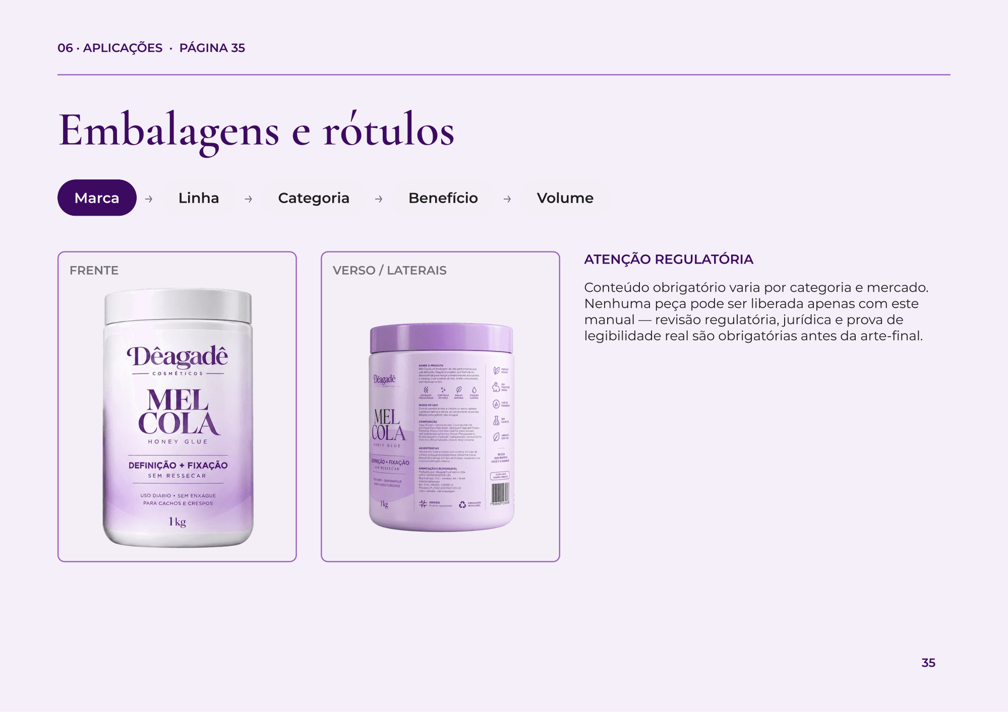
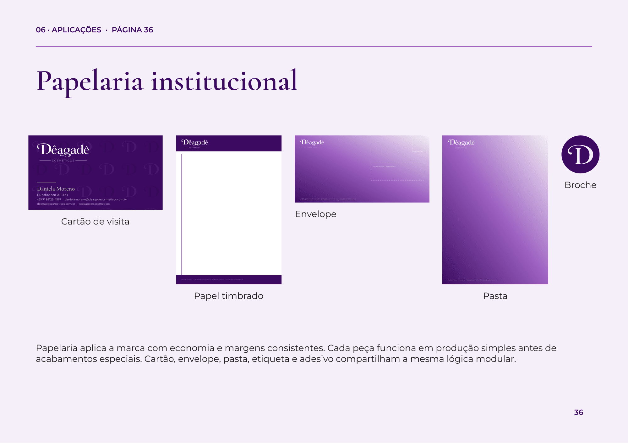
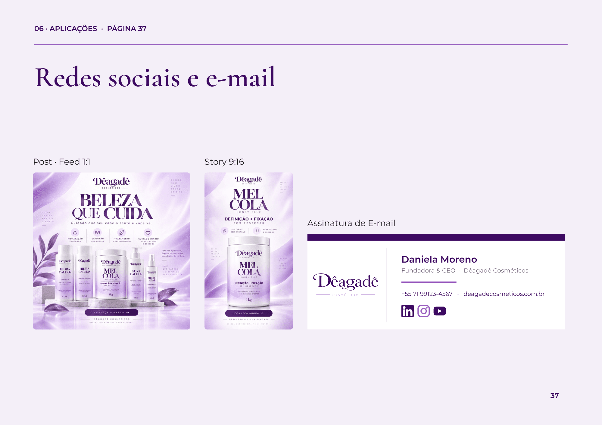
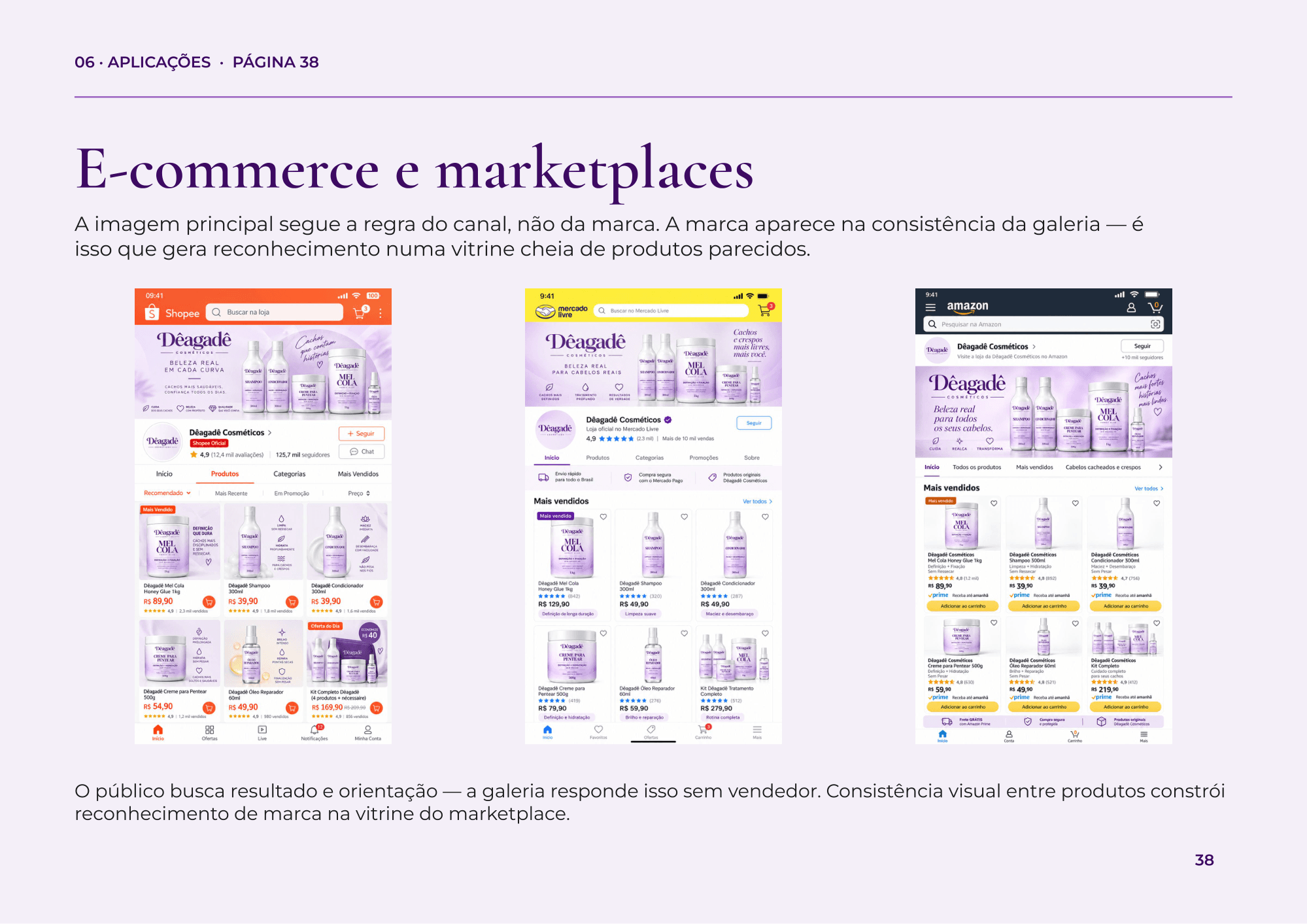
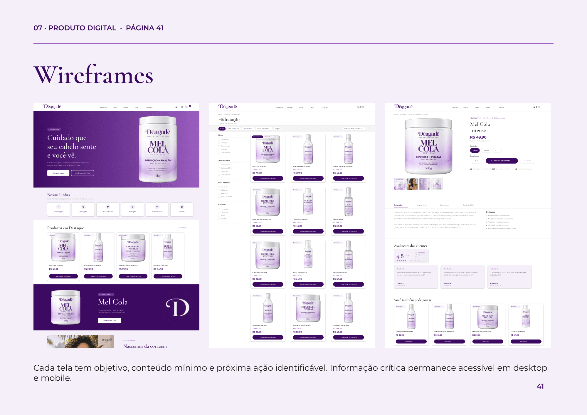
The guidelines take the brand to every touchpoint: packaging and labels with a clear information hierarchy, corporate stationery, social media, email signature, e-commerce and marketplace listings, and the website wireframes. Each application shows the identity working in the real context where it will be used.
6. Brand governance
To keep the brand consistent after handoff, the guidelines close with governance: where the master files live, how to name every asset, which approval steps a piece has to go through, and how to export for digital and print.
Results
- 44-page brand guidelines across 8 chapters, from strategy to governance.
- Approved and in use since handoff by marketing, design and tech professionals.
- A single reference for packaging, stationery, social media, e-commerce and digital product.
- An identity ready for the brand to grow beyond hair care.
Takeaways
Consistency isn't repetition. Brand guidelines need steady margins, type, color and rhythm, but every page does a different job, and the layout should follow that job: a logo specimen needs room, a palette needs comparison, a technical rule needs measurement.