
Legal · Consumer law
Viana Advocacia Especializada
A symbol that tells the niche before the name.
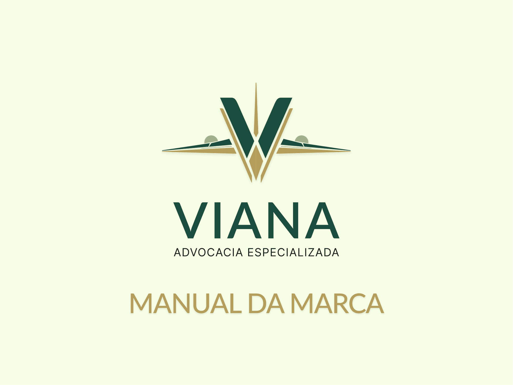
Viana Advocacia is a Brazilian law firm that serves clients in Brazil only. The brand was designed for that market, so its brand guidelines and documents were produced only in Portuguese, and the pages shown in this case appear in their original language.
The challenge
Viana is a consumer law firm that represents people with complaints against airlines. The brand had to signal that specialty and build trust, without the distance that usually comes with the legal world.
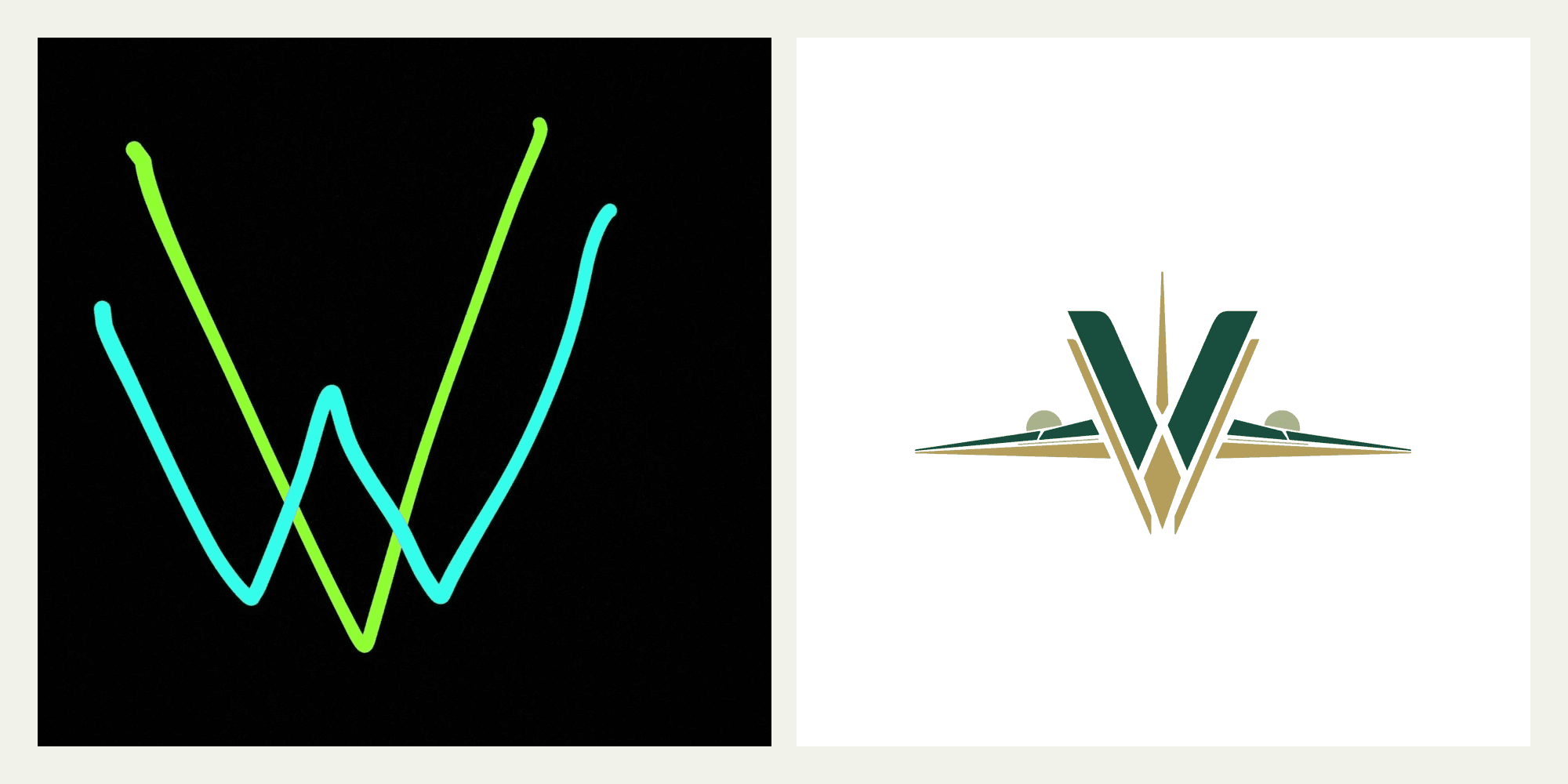
The client came in with a hand-drawn idea: a V overlapping a W. The job was to turn that sketch into a symbol that made sense for the firm's niche.
The process
1. From sketch to symbol
The V gained weight and became the base of the symbol, the W moved into the negative space inside it, and the side lines took the shape of airplane wings. The result ties the brand to aviation before any text: you read the niche from the symbol alone.
2. Identity system
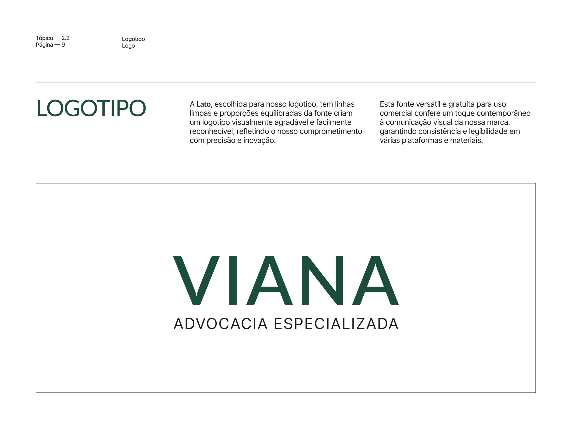
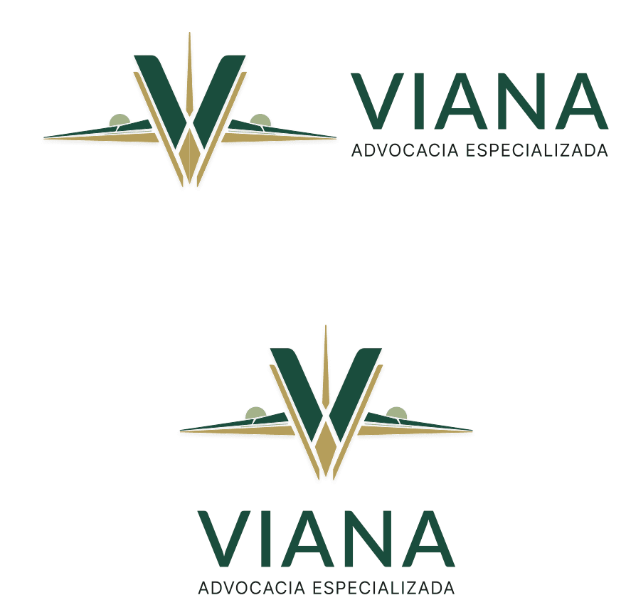
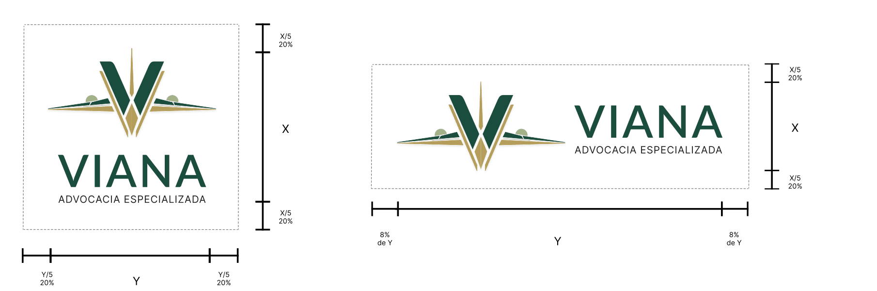
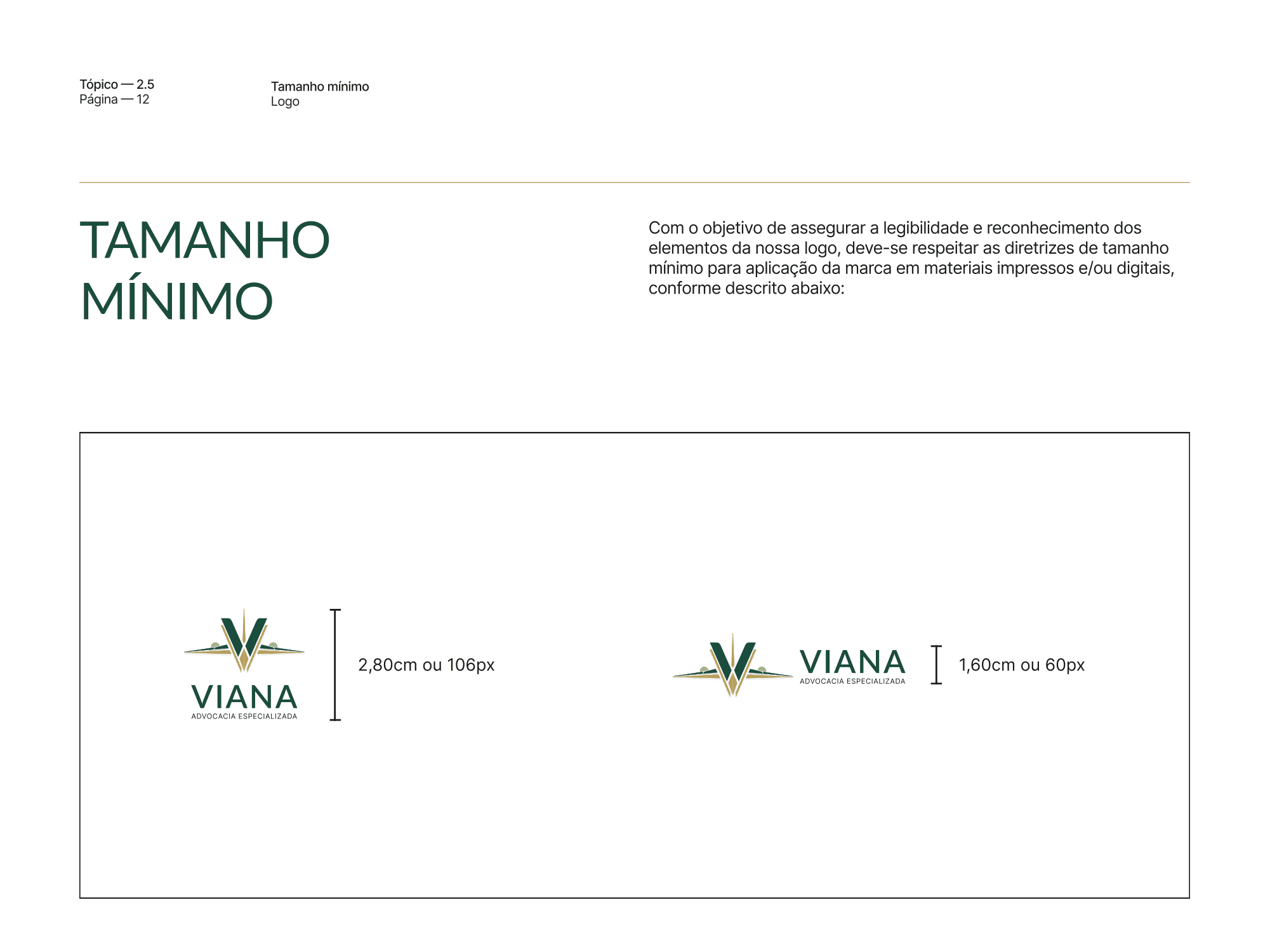
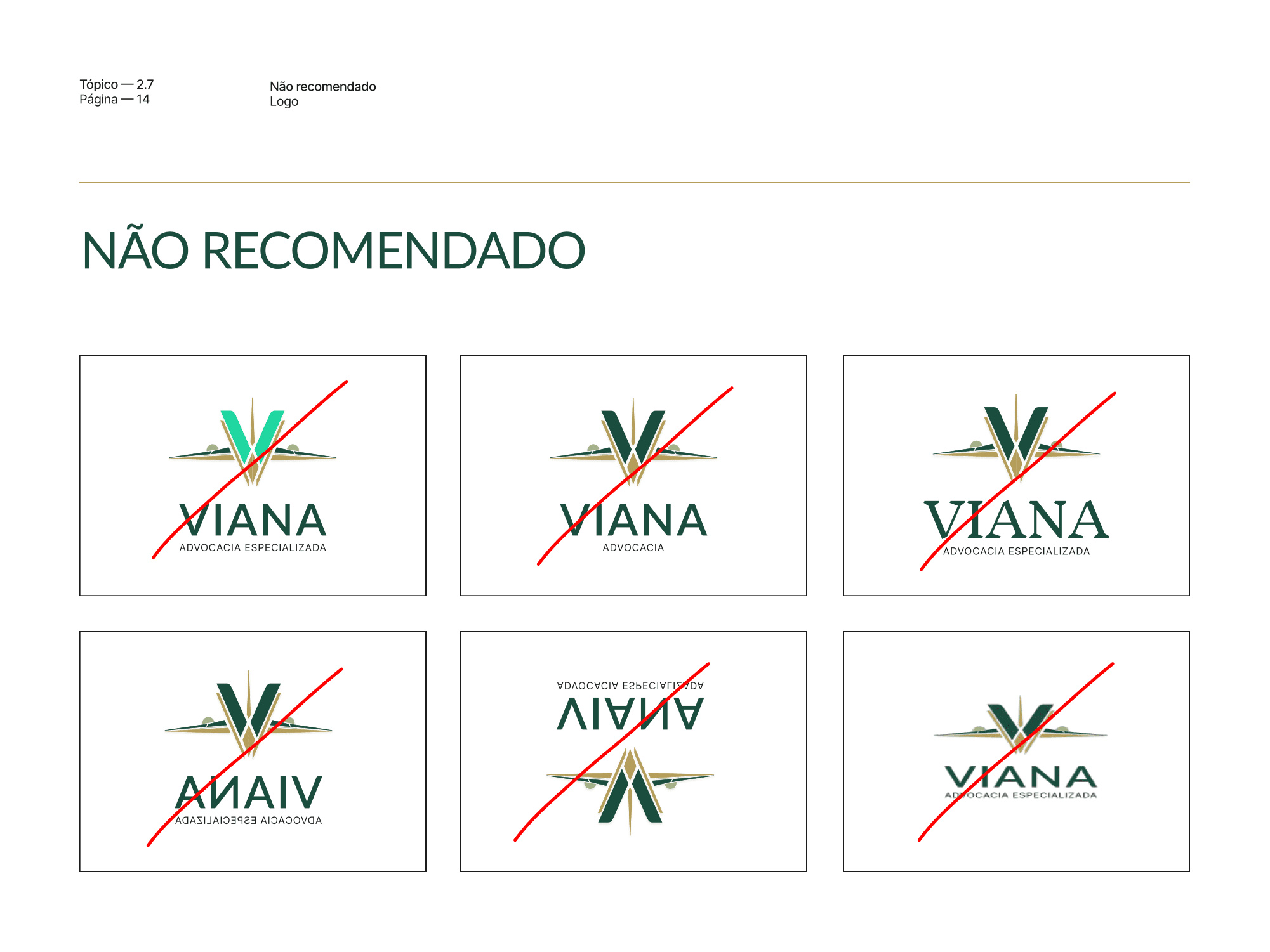
The logotype is set in Lato, with clean lines and balanced proportions. The guidelines define the vertical and horizontal lockups, clear space, minimum sizes for screen and print, and the uses to avoid.
3. Color and typography
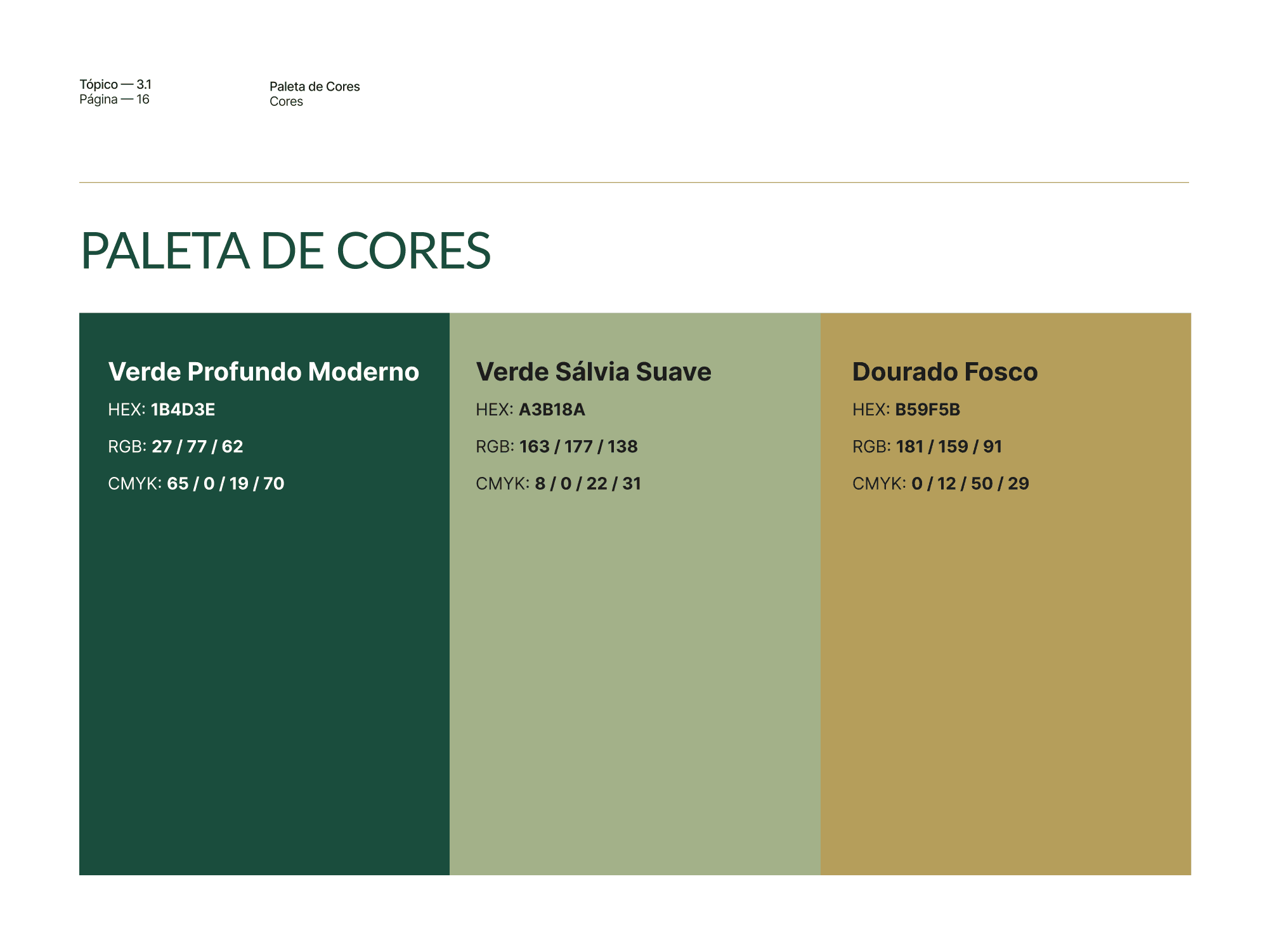
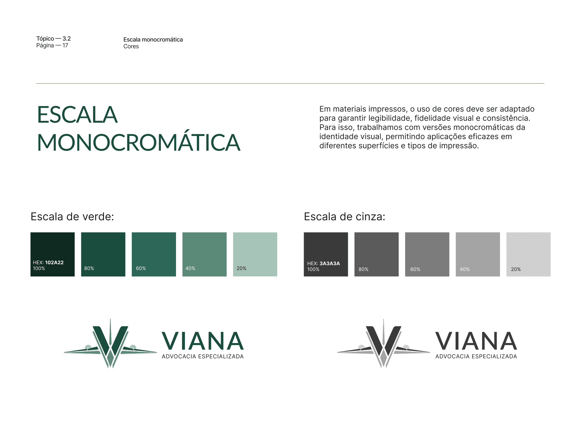
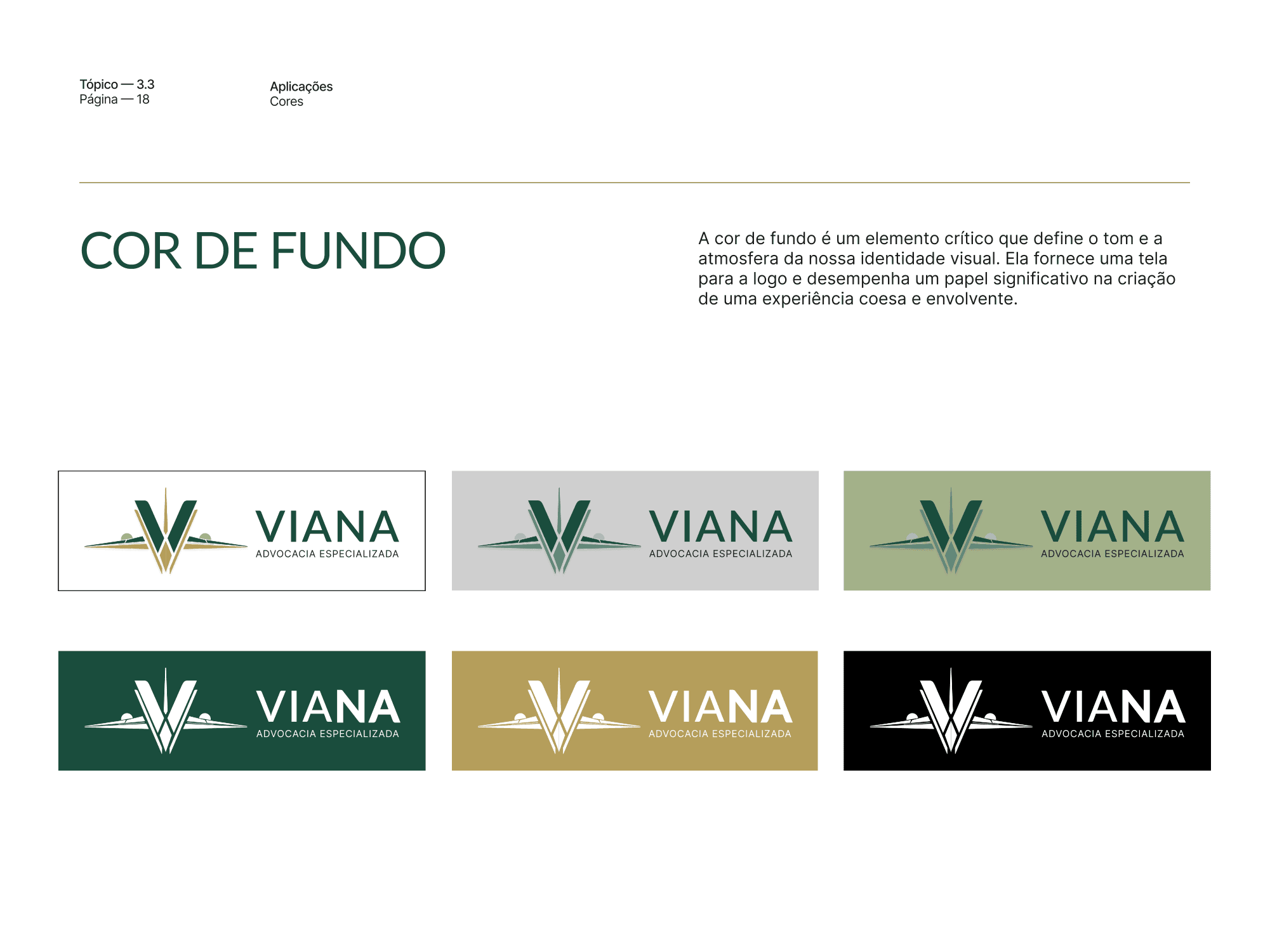
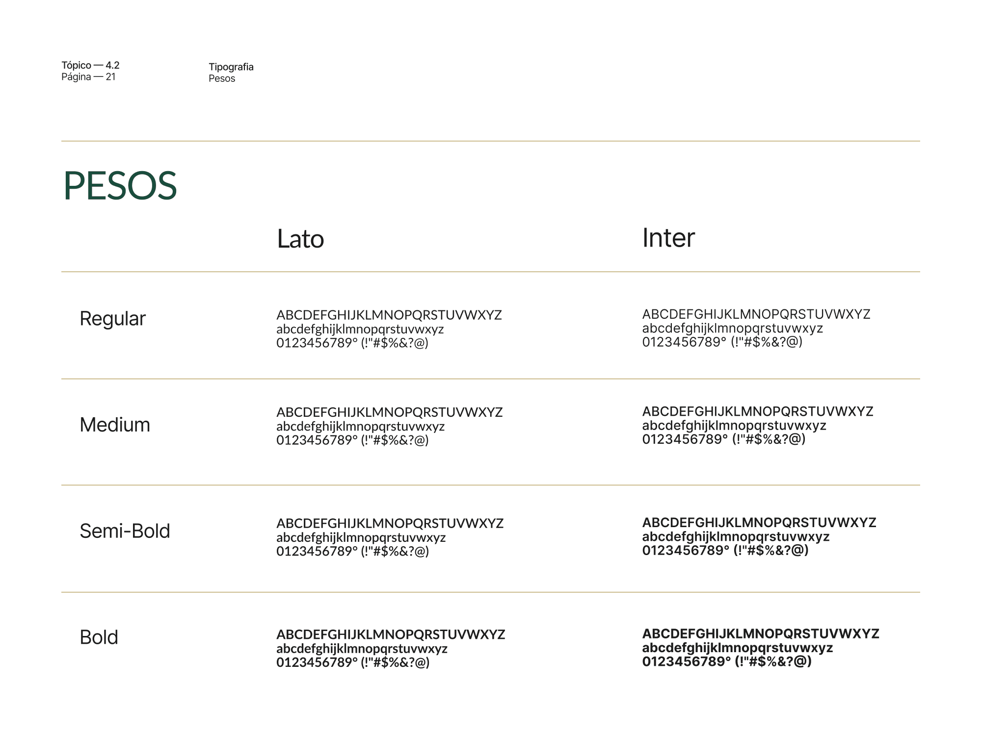
Deep green, sage green and matte gold make up the palette: serious without feeling cold. Green and gray monochrome scales cover any kind of print, and six approved backgrounds show where the brand can appear. Inter pairs with Lato for body text, chosen for how well it reads in long, detailed information.
4. Everyday documents
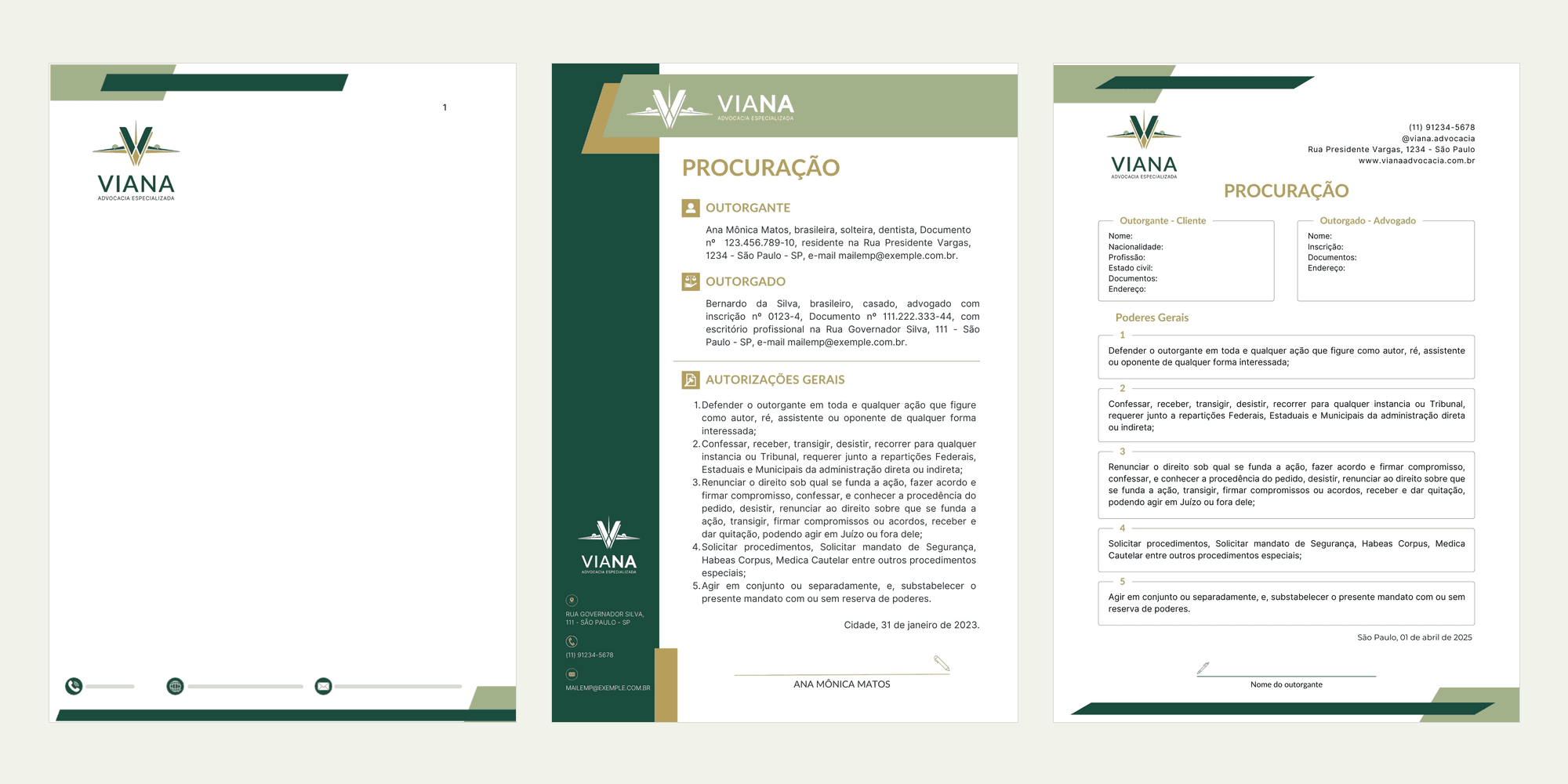
For a law firm, the brand lives in its documents. I built the letterhead as an editable Word template, plus power of attorney templates and the email signature. The two power of attorney templates show the system evolving: the first, from 2023, with a green sidebar; the second, from 2025, lighter and with fields ready to fill in.

5. Applications
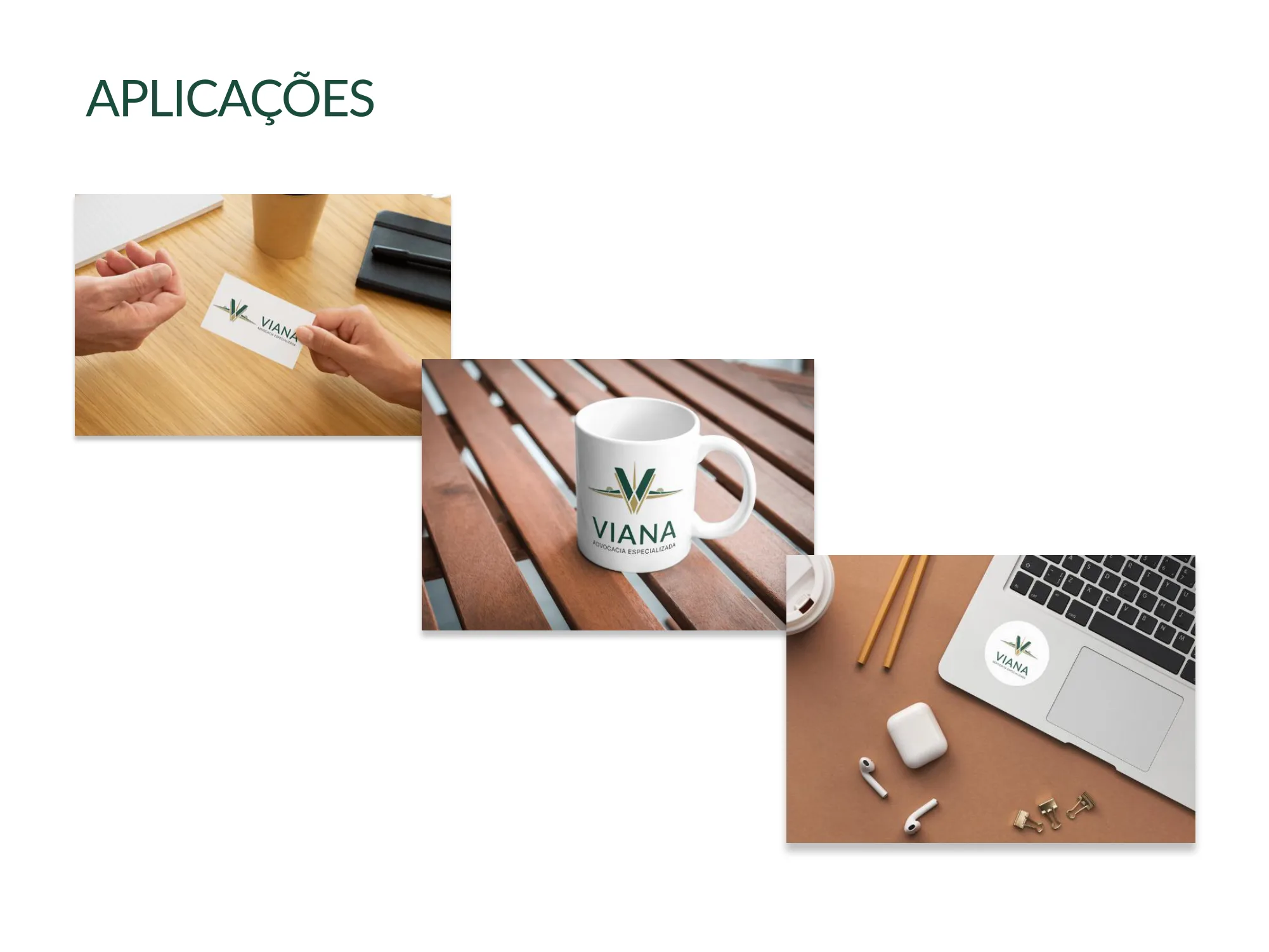
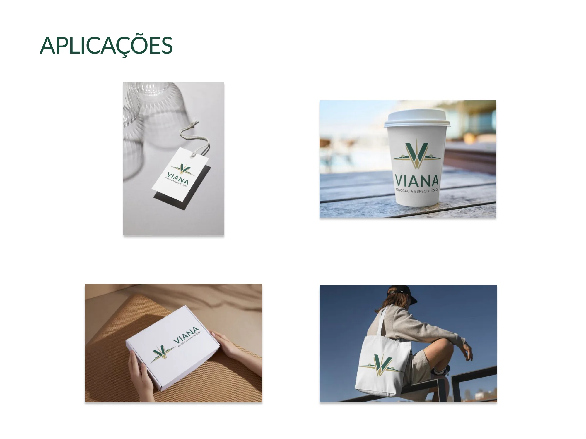
Business card, mug, sticker, tag, cup, box and tote bag: the brand on real-world pieces, to test legibility and presence beyond the screen.
How the project ran
I worked as a freelancer alongside a project manager, with staged deliveries and a deadline for each: first the logo, then the documents, and finally wrapping up the brand and its guidelines.
The project dates back to when AI was far more limited and MCP didn't exist yet. AI only helped evolve the logo idea and with small touches, like proofreading and balancing the palette. The guidelines were built almost entirely by hand.
Results
- Brand delivered on schedule, stage by stage.
- A client happy with the result.
- Documents and materials in use by the lawyers, the admin team, marketing and other designers.
Takeaways
A niche brand works when the niche shows up in the symbol, not just in the copy. Tools change, process stays: what carried this project was method, deadlines and a real conversation with the client.